
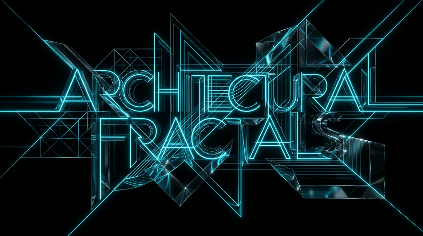
To learn how to put text in ai images, you need to isolate the words using quotation marks and explicitly define the physical placement, font style, and background contrast. Modern AI image generators require highly structured instructions that separate the text itself from the overall scene composition. By treating the letters as a physical object within the frame, you prevent the AI from melting them into the background.
It is deeply frustrating to watch a beautiful AI-generated image get ruined by scrambled letters and bizarre gibberish. You type a simple instruction for a shop sign or a label, but the generator spits out a confusing mix of misplaced symbols.
How to put text in ai images using structured prompts
Structuring your prompt requires you to separate the written message from the visual background by using quotation marks and clear positioning words. By isolating the text as its own element, you prevent the generator from blending the letters into the surrounding scenery. You must tell the AI exactly where the letters sit, what they are made of, and how they should look.
Most people make the mistake of blending everything into one long sentence. When you write a single, long-winded description, the AI gets confused about which words are meant to be drawn as letters and which words describe the scene. Breaking your description into distinct categories gives the system clear, separate instructions to follow.
The seven parts of a successful text-image prompt
An effective text-image prompt breaks the visual scene down into seven distinct parts, which include the subject, composition, lighting, camera angle, mood, style, and constraints. When you define each of these elements individually, you guide the AI to build a logical image where the text remains highly readable.
Let us look at how these seven parts work together to create a clean, professional image:
- Subject: The core object or scene, plus the exact text you want to display.
- Composition: Where everything sits in the frame, including the precise position of the text.
- Lighting: The direction and quality of light, ensuring high contrast behind the letters.
- Camera: The shot type and lens perspective, such as a close-up or straight-on view.
- Mood: The overall feeling of the image, like professional, calm, or energetic.
- Style: The artistic medium, whether it is a crisp photograph, a 3D render, or a flat vector illustration.
- Constraints: What to avoid, such as messy backgrounds, reflections, or complex textures behind the text.
By treating these parts as a checklist, you can build prompts that work on the first try. If you ever find yourself struggling to identify these missing details, a structured tool like The Prompt Engineer can ask you for these exact parameters and package them into a clean, ready-to-use prompt.
A real-world before and after example
A weak prompt relies on vague descriptions and leaves too many decisions to the generator, while a strong prompt explicitly defines the text, style, and placement. By comparing these two approaches, you can see how specific instructions prevent spelling errors and messy layouts.
Here is a classic example of how structured formatting changes the final output.
Weak prompt
A coffee shop sign that says Fresh Brew in a cool modern style with coffee beans around it.
Stronger prompt
A straight-on, close-up photograph of a minimalist wooden storefront sign.
The sign clearly displays the text "Fresh Brew" in a bold, clean, black sans-serif font.
Composition: The wooden sign is centered in the frame. The text "Fresh Brew" is centered on the sign.
Lighting: Bright, natural morning sunlight from the side, casting soft shadows.
Camera: Eye-level shot, sharp focus on the letters, shallow depth of field with a blurry background of a coffee shop window.
Mood: Welcoming, clean, and modern.
Style: Crisp, high-contrast digital photography.
Constraints: No other text, no spelling mistakes, no extra decorative flourishes on the letters.
Clear text in AI images is not a matter of luck; it is a matter of contrast, placement, and strict visual constraints.
Best practices for keeping text highly readable
To keep your text legible, you must create high contrast between the letters and the background they sit on. Dark letters on a light background, or light letters on a dark background, will always render more clearly than complex color combinations. Using contrasting values makes it much easier for the algorithm to define the boundary edges of each letter.
Avoid placing text over busy, detailed textures like leaves, brick walls, or water. If you must have a complex background, place the text on a solid sign, a label, or a clean plaque within the image. This gives the AI a flat, predictable surface to draw the letters on, which dramatically reduces spelling mistakes and distorted characters. When the background is busy, the generator attempts to merge the texture into the shapes of the alphabet, which results in garbled, unreadable lines.
A checklist for clear text in AI art
Use this quick checklist before you run your next image prompt to ensure your text comes out clean and legible. Following these simple steps will save you time and prevent wasted credits.
- Put your exact text inside straight double quotation marks.
- Specify a clean font style, such as bold sans-serif, block letters, or clean script.
- Define a solid, high-contrast surface for the text to sit on.
- State the exact location of the text, such as centered or aligned to the top.
- Include a negative constraint to ban extra letters, clutter, or decorative flourishes.
Common questions
Why does AI spell words wrong in images?
AI image generators do not understand spelling or language the way humans do; instead, they treat letters as visual patterns. If the background is too complex or the prompt is vague, the system prioritizes the overall artistic flow of the image over the precise shapes of the letters.
Which fonts work best for AI image text?
Simple, clean fonts like bold sans-serif, block letters, and clean geometric typefaces work best because they have distinct, easy-to-render shapes. Highly decorative cursive, thin serifs, or complex gothic styles are much harder for generators to render consistently.
Can I add text to an existing AI image?
Yes, you can use inpainting tools to brush over a specific area of an existing image and write a new prompt just for that section. By focusing the generator's attention on a small, isolated space, you have a much higher chance of getting clean, accurate text.
How do I stop the AI from adding extra random letters?
You can stop extra letters by explicitly listing constraints in your prompt, such as asking for no extra text, no random symbols, and no spelling mistakes. Giving the AI a dedicated flat surface, like a blank sign or card, also helps contain the text to a single, designated area.
The short version
- Always place your desired text inside quotation marks so the generator treats it as a specific set of characters.
- Structure your prompt by breaking it down into distinct categories like subject, composition, style, and constraints.
- Create strong contrast by placing dark text on solid light surfaces, or light text on solid dark surfaces.
- Use negative constraints to tell the system exactly what to avoid, such as extra letters or messy decorative elements.
Related reading
- How to Make AI Images Look Real (And Not Plasticky): Learn the specific camera settings, lighting techniques, and physical texture cues that strip the digital shine from AI-generated images.
- Text to Video Prompt Examples That Hold Together: Learn how to structure clear video prompts that prevent morphing, control camera movement, and deliver clean, usable footage.
- How to Get More Consistent AI-Generated Images: Learn how to generate matching, cohesive visuals by breaking your image prompts into seven structured parts.
- Why AI Images Don't Look Like What You Imagined: Learn how to translate the vision in your head into specific camera, lighting, and composition terms that AI generators actually understand.
- How to Get the Right Aspect Ratio and Framing From AI: Stop letting AI crop your images awkwardly. Learn how to control canvas shape and camera framing using clear, structured prompts.